
Netflix this morning announced the launch of a new interface for those who watch the streaming service on TV. The updated design is aimed at improving navigation by way of a remote control, making it quicker to get to the content you want to watch. The change involves relocating some of Netflix’s key features like the “Search” button and users’ “My List” over to a ribbon menu on the left side the screen which pops out when you navigate over. Here, it has also added new shortcuts to “Movies” and “TV” to filter its catalog by films and shows, as well as a button to see what’s “New.”
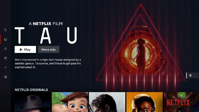
Related to this change, when you browse into a given section, you’ll now see a full-screen preview of a top show or movie autoplaying above the rows of content suggestions.
The company says the redesign was based on “rigorous research and testing” and should make Netflix simpler and more intuitive in a number of ways.
The changes should be fairly welcome by TV viewers – except for those who despise auto-playing trailers, of course.
As Netflix’s catalog has expanded over the years, it’s gotten more difficult to find something to watch due to the paradox of choice. The service makes recommendations based on your past viewing history, and offers thematic groupings, like “Trending Now,” “Comedies,” “TV Dramas,” plus things like your “Top Picks” and more, which will have you scrolling down endless rows of suggestions.
But when you decide you want to start over and go back to your List or start a new search, you have to click, click, click on the remote to move back to those options.
With the redesign, you’ll only have to click over to the side.
It’s an obvious change – and Netflix even admits that – but says that it still took “extensive research, testing and technology improvements” to make it happen.
The larger goal in simplifying navigation is to reduce the time users spend browsing, thereby increasing their viewership hours.
Unlike traditional cable TV, streaming video on demand services can sometimes struggle to connect their viewers to content because users get stuck browsing the content undecided. TV, on the other hand, would just start playing something as soon as it turned on. Although loud and interruptive, this interface often helped people discover new shows – they’d have to view the content even as they clicked the remote.
Netflix has tried to embrace this “just start playing” mentality, too, with things like the auto-playing trailers and autoplaying the next episode in a season you’re watching. Now it’s doubling down on those auto-playing trailers with this TV update.
The redesigned interface arrives shortly after the company presented weaker earnings with subscriber growth and revenue falling short of expectations. The stock tanked, but then began to recover – it seems no one is ready to count out Netflix yet.
Netflix says the new TV interface will begin rolling out in the months ahead to subscribers worldwide.