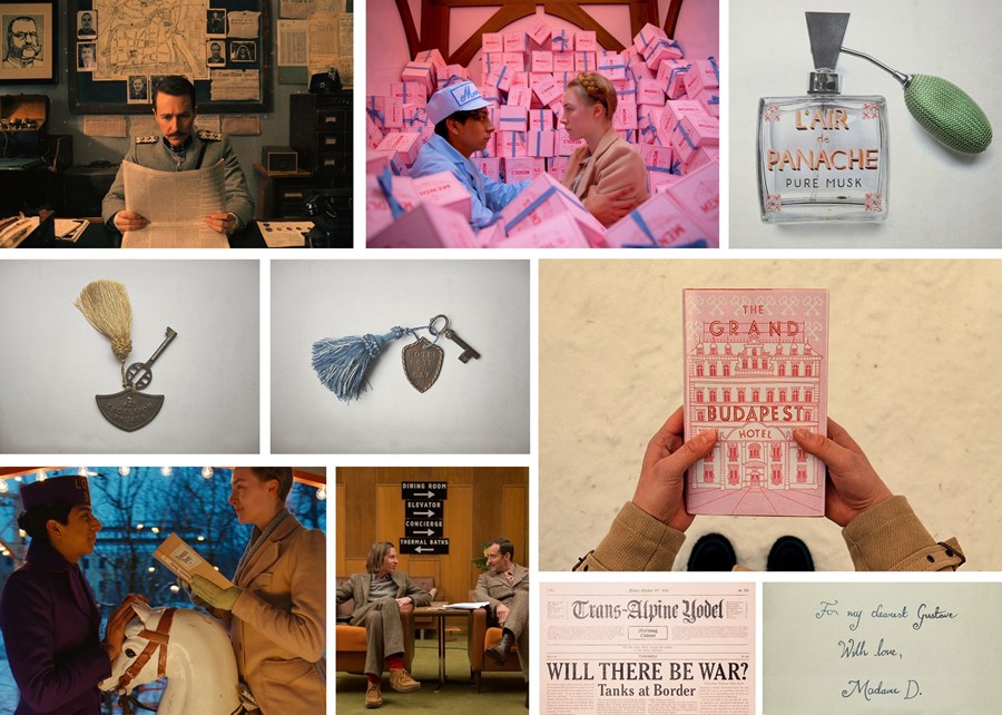
How far does the auteur director go to make his films that extra bit special? We ask The Grand Budapest Hotel’s lead graphic designer Annie Atkins
In 2012 graphic designer Annie Atkins found herself perched on top of a mountain for the German winter. Which was fine – she was, after all, on the majestic set of Wes Anderson's The Grand Budapest Hotel. Literally thrown in head first, Atkins had a week between 'the phone call' from Anderson's team and her introduction to the fictional country of Zubrowka where she headed up a small team alongside award-winning production designer Adam Stockhausen. Previously creating graphics and props for period dramas like The Tudors, the Irish-born designer was responsible for every graphic in Wes's aesthetically pleasing, perfectly symmetrical world – from maps to stamps, antique pornography and prison door numbers. We caught up with Atkins at It's Nice That's Here 2015 festival earlier this month – an annual conference where a handful of the world’s best creative talent come together to discuss their work – to talk about spelling errors, die-hard fans and taking business card design tips from the Nazi Party.
EMBRACE THAT MAGIC MOMENT
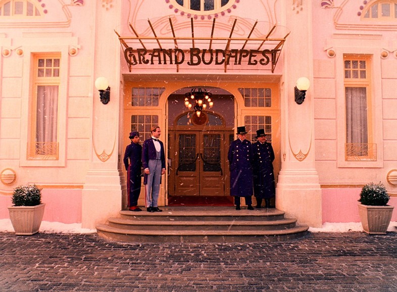
For the 2014 hit, the cast and crew took over an abandoned department store called the Görlitzer Warenhaus on the verge of bankruptcy in Görlitz. Well preserved, especially for a building that was in existence during two World Wars, Atkins could see the film's star quality from the beginning. “I remember the first day I walked onto the set. It’s weird because when you’re working on things and seeing things onscreen you’re never really sure how it’s going to look in real life, but I walked onto set and it just looked amazing – really rich reds, purples, pinks, gold, beautiful paintwork on the hotel interior. That day I was like ‘Wow, this is gonna be something really special’.”


MAKE COPIES OF EVERYTHING
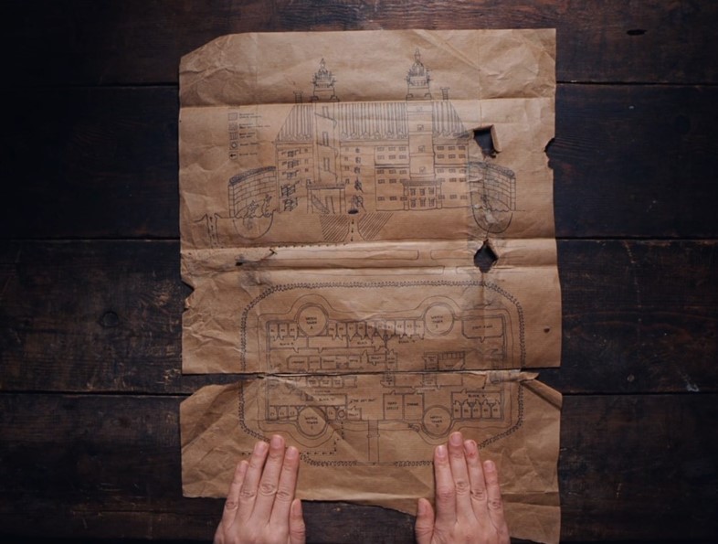
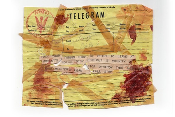
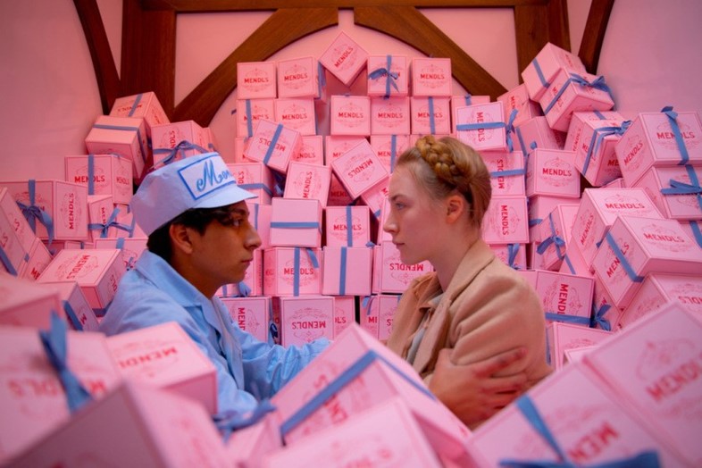
“We never make one of any graphic. It’s the first thing that goes on set and gets coffee spilt over it, it could get ripped, it could get damaged by rain or snow,” reveals Atkins, who, not surprisingly, has lost count of the number of graphics her and her team created for the film. “We usually make six absolutely identical versions of all paper graphics. If the actor’s going to rip it up in front of the camera then you need to make twelve identical pieces because they might need to do 12 takes. If you’re working for Wes Anderson you need to make 30 identical pieces because he might want to do 30 takes: each one with everything in exactly the same place.” A laborious task, yet Atkins reaped the benefits when the film wrapped – taking home her favourites, including the now-infamous The Grand Budapest Hotel book in the opening scene, a Mendl's box and a bloodstained telegram from Serge the butler.

ON WORKING IN WES’S WORLD
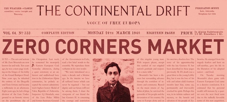
For a man whose imagination seemingly knows no bounds, how does Anderson siphon his ideas into 3D form? “He is such an auteur director. He pays attention to every little thing. It’s not just graphics – it’s the same with every department. He’s quite particular but he’s also really experimental. He loves to try different things so working with him really made me feel like I loved this work again. It was fascinating.” With an eye on every last detail, Anderson even designed the news stories that – he knew – would never be read. “Because it’s a fictitious country you have to create the Trans Alpine Yodel, which was the main daily newspaper, but then Wes also used other newspapers to tell other parts of the story – it was like an entire national press. He wrote the articles, and he wrote some lovely newspaper titles like Continental Drift and The Daily Fact.”

WATCH YOUR OWN BACK
As meticulous as an Anderson production might seem, things don’t always go to plan. Atkins admits that the now-infamous Mendl's boxes, for which there were thousands of created for the film, actually contained a huge mistake. “You have a responsibility, not just to graphic design but to language, spelling and grammar. Nobody is watching out for your mistakes,” she says. “I take a lot of pride in my spelling and grammar, so when Wes contacts me and says, ‘I think there is a spelling mistake on the Mendl’s box,’ I was like, ‘I don’t think so.’ (laughs) But actually there was a mistake. I spelled ‘patisserie’ wrong! There’s really no excuse for it, especially with foreign words. You need to double-check everything. At this point, we had shot quite a few of the boxes. We’d actually made thousands of them. They had to fix this in post which was embarrassing. Luckily Wes is a really nice guy as well as being a genius.”

IN HOLLYWOOD, THERE’S NOWHERE TO HIDE
But what happens when things slip through? Where there's fans there's die-hard fans and, as Atkins found out, there's nowhere to hide from your mistakes if they're being splashed across the silver screen. “We have to think about a thing called continuity because we don't shoot the story in order. It's the most boring part of making a film yet it becomes the most fascinating part for an audience when it goes wrong. So what happens if you don’t get your ripping and folding and things in the same place? You end up on the IMDb ‘Goofs’ page.”

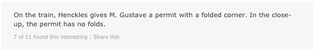
“They’re right. This is the permit we lovingly made: printing, typing, stamping, calligraphy, handwriting, and then we made an envelope for it, and we rolled wax over the envelope so it looked dirty and old, because this was something that was supposed to be in someone’s pocket for ten years. Then we made our 16 identical copies. It’s true – one of those corners does not have a fold on it, and someone noticed it.”

“They’re right! When we made the calendar, we didn’t think to check this – but we didn’t think that anybody else would either. Am I worried about this kind of thing? No, I’m not. This is extreme, but it’s a good example of how much detail we do put into things.”
BE AUTHENTIC
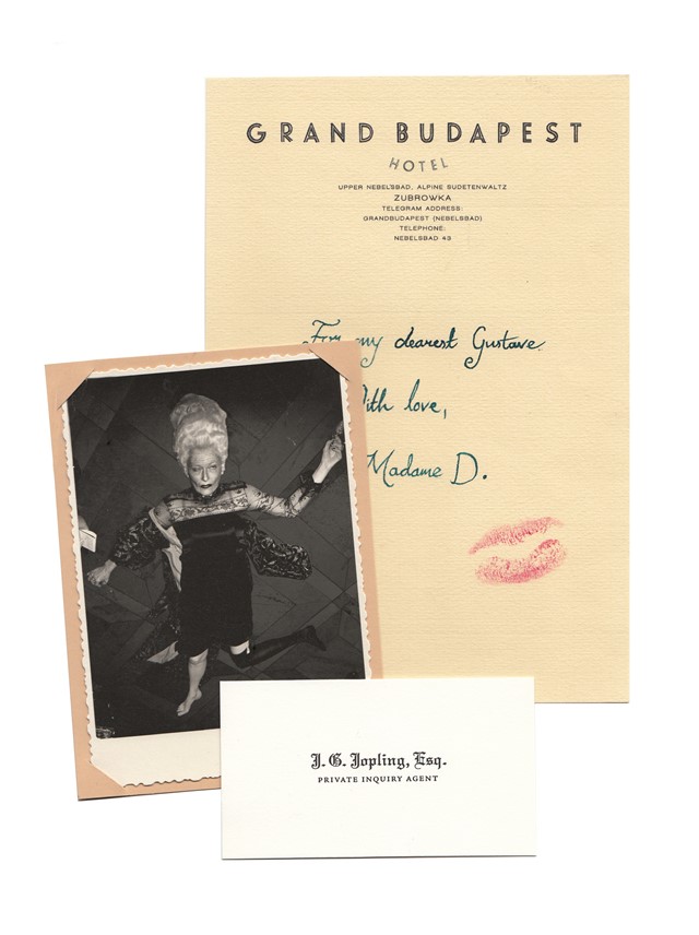
In order to make an audience believe they're being transported back in time to Germany in the 1900's then you have to take them there and it needs to feel authentic. “If they are watching something old they don’t want to see bright white paper because it snaps them out of the show. Even though it would be brand-new at the time. It’s a very fine balance – a bit of an art in itself,” Atkins explains. “By the time I got onboard Adam Stockhausen and Wes had already collected hundreds of amazing references of all kinds of things from 1930s Eastern Europe. We had a big gallery of reference material and I collected more and more as we went on, so every time we started a piece we’d look at a reference from that time. No matter what it was. For Jopling’s character – one of the fascists in the movie – we looked at real fascists’ business cards from the 1930s in Germany. We combined Himmler’s with Eva Braun’s for Jopling’s character.”

SO...WHAT’S THE POINT OF IT ALL?
Creating thousands of graphics and props for a scene where said graphic or prop might flash across the screen for a millisecond might seem strenuous, but Atkins remains assured that every detail doesn't go unnoticed. “Sometimes we ask what is the point of making this stuff if nobody is going to see it? The answer is people do see it! The people that see it are the actors and the director. If you can give those actors authentic feeling props that have little details that take them into this world then I think in some tiny way it goes towards the movie as a whole. Even if the cinema audience is never going to see that 1800s document in close up.”